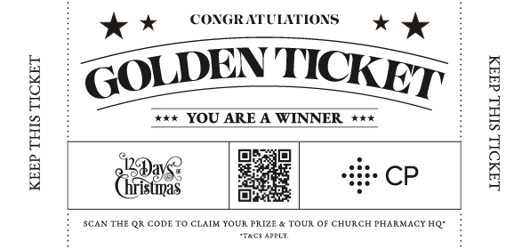
Golden Ticket Design
To begin this project I started the research phase. I was excited as this was something new and I’ve always loved those vintage tickets and old boxing promo posters. I was eager to make a physical ticket based on typographic design with little image elements. So, I began building boards based on those vintage prints from train tickets, bar coasters, match boxes, music posters and so on. I think the biggest take away I had from the average of these was the way they used type. So often the lettering would follow arcs, curves, waves or run vertically. Also, so many utilised the space so well filling it with so much information but they always had such clear hierarchy.
I decided that even though this could have some creative freedom, it still needed to reference the 12 Days Campaign. The audience would need to know from glance that were part of the same campaign and not independent. This placed some limitations but offered more room for creativeness within the boundaries. Keeping the purple colour and fonts was a happy medium and now progress could begin.